
Make sure you remove the code when you are not needed News or Announcement Pop Up on HTML:
Here how you add and remove:
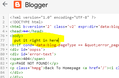
Login to Blogger > theme > edit HTML > next to " <body> "
Copy the code and past it.
When you want to remove? do the same path and delete the code that you past
"""
<div class="tybar"><span class="blink_me">NEW!</span>Covid-19<span class="bar-but"><a href="https://www.Youtube.com">Click Here</a></span><i class="fa fa-times"></i></div>
| <style> | |
| .tybar{width: 100%; | |
| margin: 0; | |
| height: 50px; | |
| display: table; | |
| font-size: 17px; | |
| line-height: 50px; | |
| font-weight: 600; | |
| -webkit-font-smoothing: antialiased; | |
| color: rgb(255, 255, 255); | |
| font-family: Ruda; | |
| border-color: rgb(255, 255, 255); | |
| background-color: #786ab7change this clor to any clor you want orginal color:black"#0e1032"(no quote) ; | |
| box-shadow: 0 1px 3px 2px rgba(0,0,0,0.15); | |
| text-align: center;} | |
| .tybar .bar-but{font-size: 17px; | |
| font-weight: bold; | |
| margin-left: 25px; | |
| background: #fff; | |
| padding: 5px; | |
| color: #fff; | |
| background-color: #f2132d; | |
| line-height: 1.05; | |
| padding: 4px 15px; | |
| cursor: pointer; | |
| text-decoration: none; | |
| border-radius: 3px;} | |
| .tybar .bar-but a{color:#fff; text-decoration: none;} | |
| .tybar i { | |
| float: right; | |
| padding-right: 40px; | |
| cursor: pointer; | |
| line-height: 50px; | |
| } | |
| body{margin-top:-49.33px;} | |
| body{margin-top:49.33px ;transition:600ms;-webkit-transition:600ms;-moz-transition:600ms;-o-transition:600ms;} | |
| .toggleclose{top:-75px!important;} | |
| .togglebody{margin-top:0!important;} | |
| .fa-arrow-down { | |
| position: fixed; | |
| right: 30px; | |
| top: -2px; | |
| background:#00BE98; | |
| color: #FFFFFF; | |
| width: 40px; | |
| height: 30px; | |
| border-radius: 3px; | |
| line-height: 26px!important; | |
| padding-top: 10px; | |
| padding-right: 0!important; | |
| } | |
| .tybar{z-index:99999;top:0;transition:600ms;-webkit-transition:600ms;-moz-transition:600ms;-o-transition:600ms;position:fixed} | |
| .blink_me { | |
| color:#f2132d; | |
| margin-right:10px; | |
| -webkit-animation-name: blinker; | |
| -webkit-animation-duration: 1s; | |
| -webkit-animation-timing-function: linear; | |
| -webkit-animation-iteration-count: infinite; | |
| -moz-animation-name: blinker; | |
| -moz-animation-duration: 1s; | |
| -moz-animation-timing-function: linear; | |
| -moz-animation-iteration-count: infinite; | |
| animation-name: blinker; | |
| animation-duration: 1s; | |
| animation-timing-function: linear; | |
| animation-iteration-count: infinite; | |
| } | |
| @-moz-keyframes blinker { | |
| 0% { opacity: 1.0; } | |
| 50% { opacity: 0.0; } | |
| 100% { opacity: 1.0; } | |
| } | |
| @-webkit-keyframes blinker { | |
| 0% { opacity: 1.0; } | |
| 50% { opacity: 0.0; } | |
| 100% { opacity: 1.0; } | |
| } | |
| @keyframes blinker { | |
| 0% { opacity: 1.0; } | |
| 50% { opacity: 0.0; } | |
| 100% { opacity: 1.0; } | |
| } | |
| @media screen and (max-width:800px) { | |
| .tybar{display:none;} | |
| body { | |
| margin-top: 0; | |
| } | |
| } | |
| </style> | |
| <script> | |
| //<![CDATA[ | |
| jQuery(document).ready(function(){ | |
| jQuery( '.tybar i' ).click(function() { | |
| jQuery( '.tybar' ).toggleClass( 'toggleclose' ); | |
| jQuery( 'body' ).toggleClass( 'togglebody' ); | |
| jQuery( '.tybar i' ).toggleClass( 'fa-times' ); | |
| jQuery( '.tybar i' ).toggleClass( 'fa-arrow-down' ); | |
| }); | |
| }); | |
| //]]> | |
| </script> """" |
0 comments: